Research into at least 2 other sound recordings


I have looked at different audio books and digital books. The audio book I listened to was Harry Potter. What I liked best about the Harry Potter audio was that it was narrated by Steven Fry, who’s voice really brings the characters to life and the magic to life. A negative could be that, depending on the age of the child, the audio book might take a long time to be completed. A young child at bed time might falling asleep or losses attention to the story.


The second audio book I have chosen is Winnie the Pooh. What I liked about Winnie the Pooh is that the of the different characters are all voiced by different actors such as Steven Fry and Dame Judy Dench which, along with the sound effects, makes the recording interesting. Each of the short stories are unique and different. The stories are short, have a start, middle and end and therefore would retain the child’s interest all the way through. A negative could be that once you heard the five stories it would get boring to hear them again and again.

Evaluate the use of sound and the impact on the audience

Sound can better help to immerse the audience in a film. By adding sounds like rustling leaves in a jungle scene this makes it look like it is actually happening. The audience can feel like they are actually there.

Music can also make a big difference because it also can help the audience feel the emotion of the scene. For example, in an action scene, the wrong music or sound would ruin the moment but the right music playlist would increase the enjoyment of the audience.

Typefaces

Serif typeface

in typography a serif is a little flick at the end of an letter or syllable

an example of a serif typeface is the Baskerville typeface

Capture


Sans-Serif typeface

in typography sans-serif is font that douse not have an serif at the ends of letters and syllable in french it means without

an example of an sans-serif is the News Gothic typeface

capture 2


Display typeface

in typography display type is a font that is used for mainly for large headings rather then using it in the main text they also have more varied designs then body texts.

An example of an Display typeface is the Exocet typeface

Exocet


Script typeface

in typography script typeface is based on handwriting this is usually used for displays


an example of an script typeface is the American Scribe typeface

American_Scribe.svg


Decorative Typeface

in typography decorative typeface is mainly used for decorative texts

an example of an decorative typeface is the Jim Crow typeface

Jim_Crow


Header

in typography a header is a piece of text that is separated from the rest of the text and is  at the top of the screen or page. word-processing programs usually allow for customisation witch is usually the same on all pages apart from the page number

an example of an good header typeface is the Bebas Neue

Screen Shot 2018-10-11 at 10.03.24


Sub header

in typography a sub header is a header that appears at the bottom of the page and describes the contents


Body text

in typography the body text is the main piece of text of an book or magazine or other printed material. body text has two different meanings book design and type setting

an example of  a good body text font is Source sans pro

Screen Shot 2018-10-12 at 13.24.17


Tracking

in typography tracking in the spacing between each letter


Leading

in typography leading is the spacing between each line

Andrew Byrom

Andrew Byrom is a British graphic and typecast designer that is currently living in los angles he studied typography at the university of east London. He finds inspiration for typecast by looking at everyday objects like band aids and chairs. He douse it because he wants to push himself to work in 3 dimensions to be able to make new forms.


Some of the examples of the work he does are. In 2008 he made letter box kites and set them off in Seal Beach in California these where made from nylon fabric and fibre glass poles.

-0


Here is an Image from when it happened.


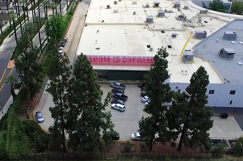
Another one of his works is that in 2016 he made an installation that is animated when viewed by a moving train he was commissioned by Azusa pacific university to create an insulation on their campus.

-1


Here is the work from the train


And at the University of Cumbria in the north of England uses aluminium as bunting that are each layered and moves independently of each other and letters that spell out his name and the name of the piece witch is called field work that hangs from the roof of the building to the grass.

-2


Here is his work from then.


He inspired my project by using the environment to find letters and numbers to make my alphabet and the work he did above also helped with my inspiration by thinking outside the box.


https://www.designboom.com/design/andrew-byrom-letter-box-kite-st-julian/

https://www.designboom.com/art/andrew-byrom-typographic-installation-azusa-pacific-university-wisdom-is-supreme-06-04-2016/


Andy Goldsworthy

Andy Goldsworthy


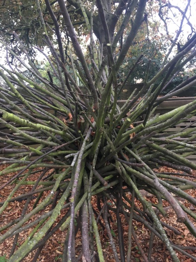
Andy Goldsworthy is a British sculptor and photographer born 1956 in Cheshire he studied fine art at the Bradford College of art and at the University of Central Lancashire at the age of 13 he started working on farms and has since likened the repetitive tasks of farming to the creation of sculptors. Photography is an important part of his art process due to it not lasting very long. Goldsworthy has produced work for the courtyard of san Francisco De Young Museum called ‘’drawn stone’’ witch depicts the frequent earthquakes in San Francisco. Most of the materials used in his work are usually brightly coloured flowers and leaves also for most of his works he only uses his hands, teeth and tools that he has found for the more permanent works he has used machine tools.


Here is some of the work that he has done

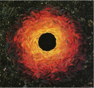
1

Name:Rowan leaves with hole

Date that it was made:Some time in 1987

Description:A hole surrounded by a multitude of rowan leaves in multiple states of decay going out from the lighter from the centre to the darker colours on the outside this is giving off very other world feeling


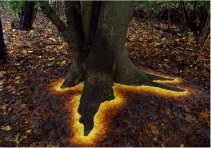
2

Name:Sycamore leaves edging the roots of a sycamore tree

Date that it was made:November 1 2013

Description:A sycamore tree that is surrounded by sycamore leaves of various shapes and with a focus of yellows and oranges this gives off a very mystical feeling


Design a site like this with WordPress.com
Get started